Kidwell Rebrand
“See Beyond” - The Kidwell Brand Story
Kidwell came to us with a problem: They were a rapidly growing technology integration company, but always struggled to tell their story. People and businesses had a hard time knowing exactly what Kidwell was about, which created even greater confusion in the marketplace.
As the company continued to expand its specialized services, it needed to refresh its brand and create a story that would help potential clients “see beyond” their challenge to what was really possible with the right technology in place. Working with their leadership, our team gathered information on Kidwell’s vision, challenges, and competition. From there, we developed a holistic approach to Kidwell’s visual brand and positioning to elevate awareness and educate existing and prospective clients of the company’s full services.
At the heart of this rebrand was positioning Kidwell as an expert who brings all of these specialized skills together to, not just fix a problem, but to help businesses accomplish even more through technology. The rebrand for Kidwell included implementing the phrase, “See beyond the technology to what’s possible.” This serves as a mantra for clients and internal teams because it asks them to think bigger and open their minds beyond the challenge or the task at hand.
Work we did:
• Brand identity
• Business collateral
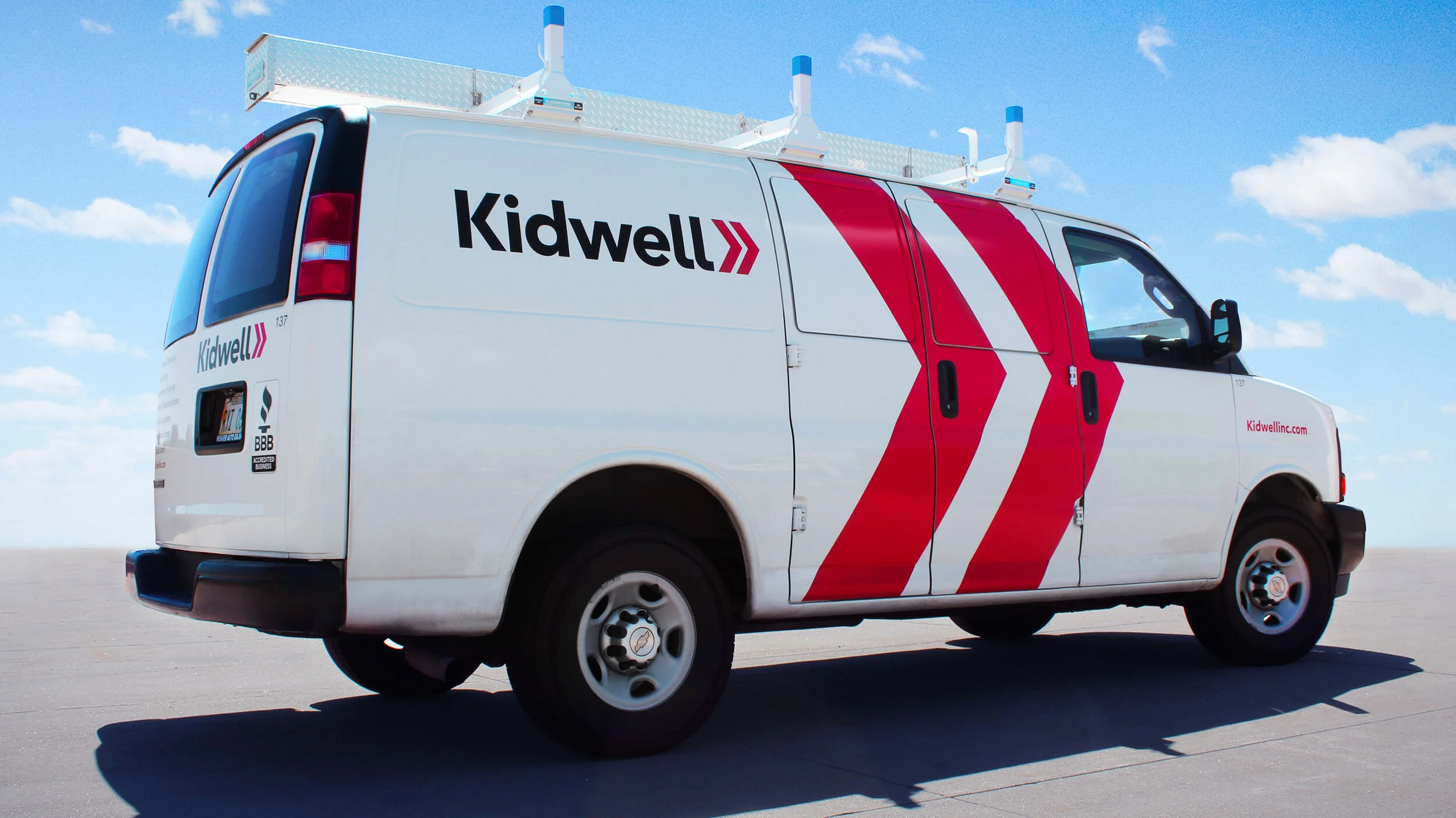
• Fleet vehicles
• Motion graphics
• WebsiteWhen it became orange:
Very soon after the launch, we were walking into our office, and we stopped suddenly. There in front of us were two brand new Kidwell vans with the new branding. They were striking. It’s always surreal sometimes to see months of work finally hit the road.
“Branding is obviously what Daake does best, but their communication is a close second.”
Todd Long
Executive Director of Innovation & Marketing
Kidwell


