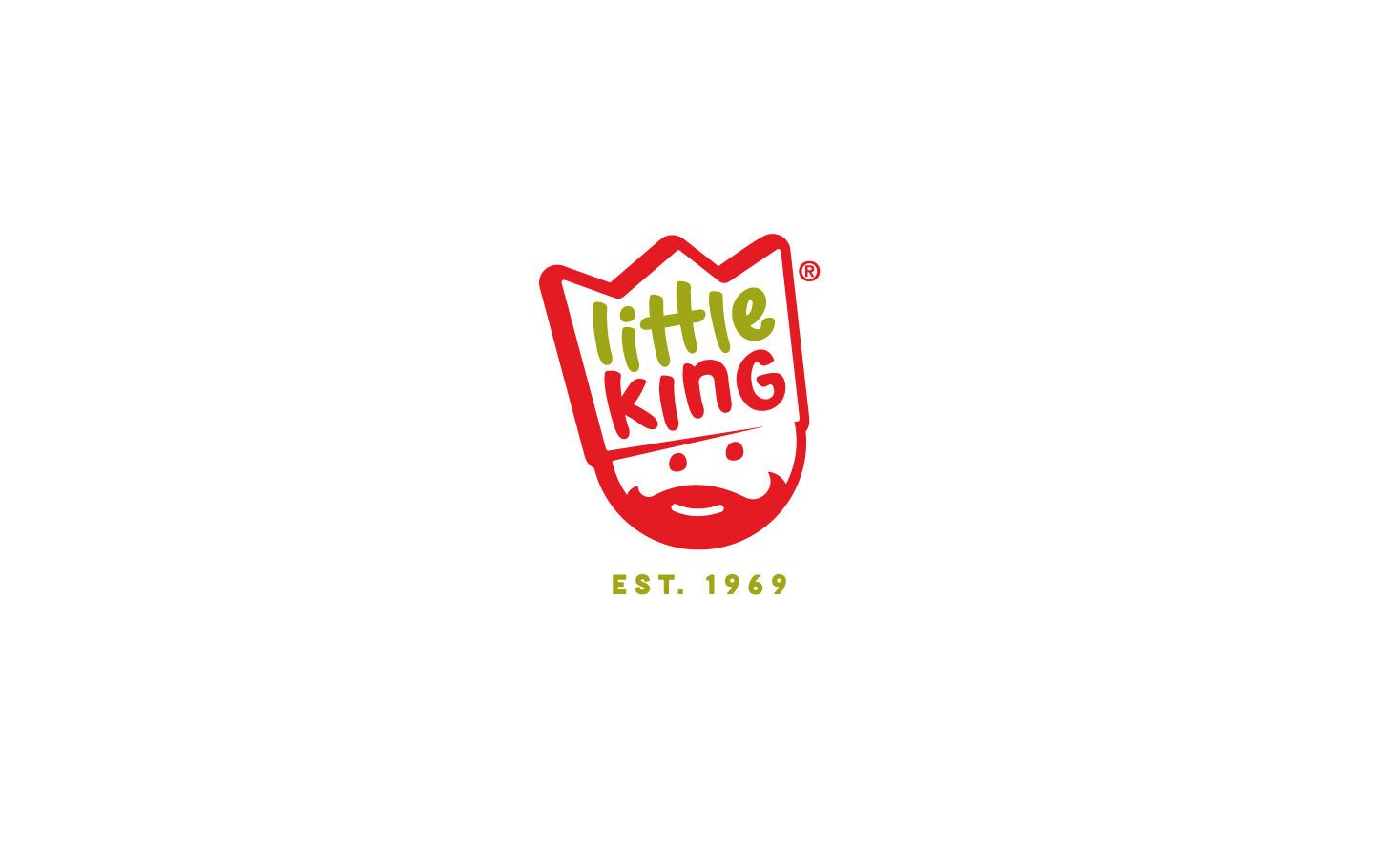
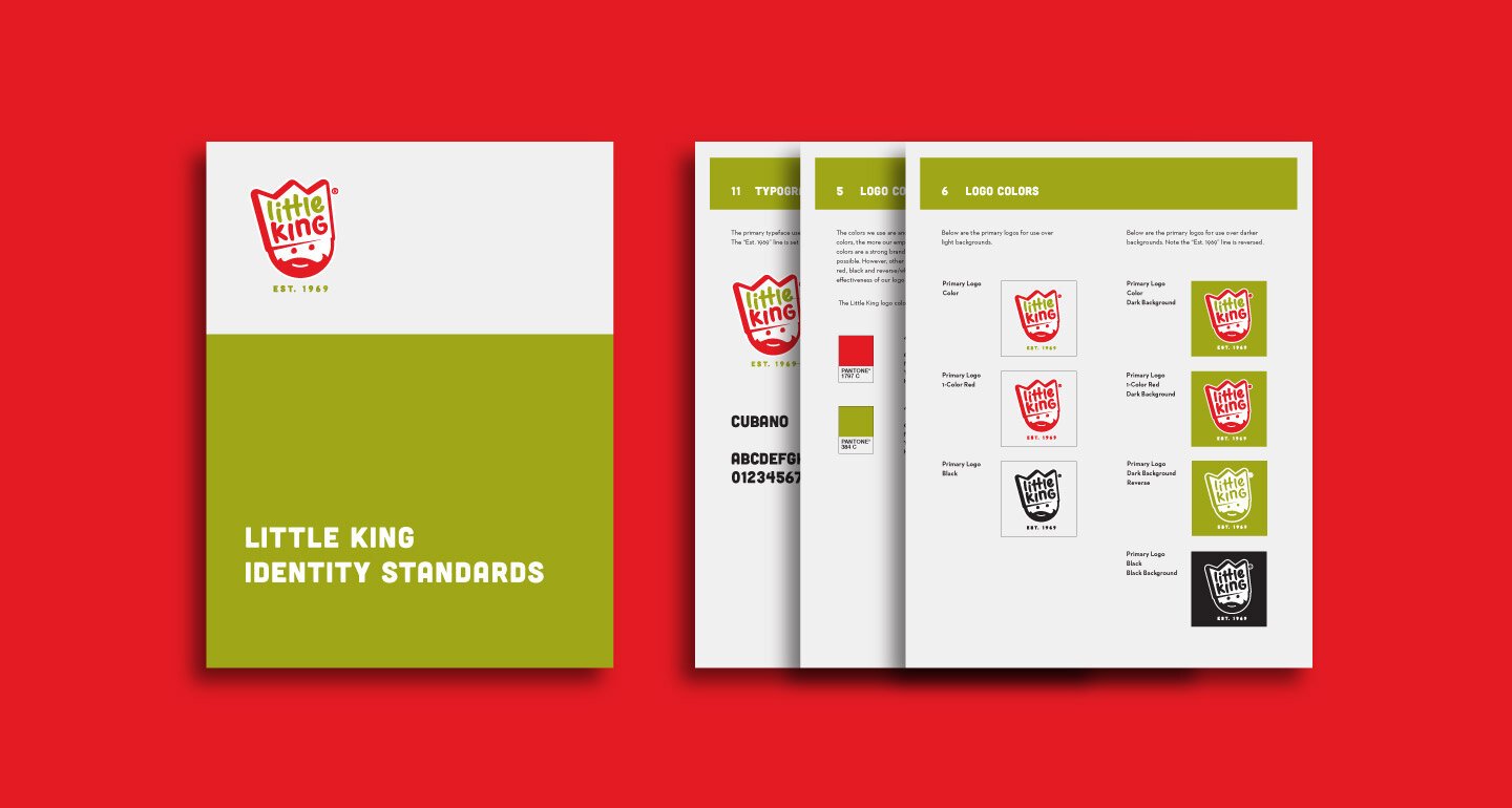
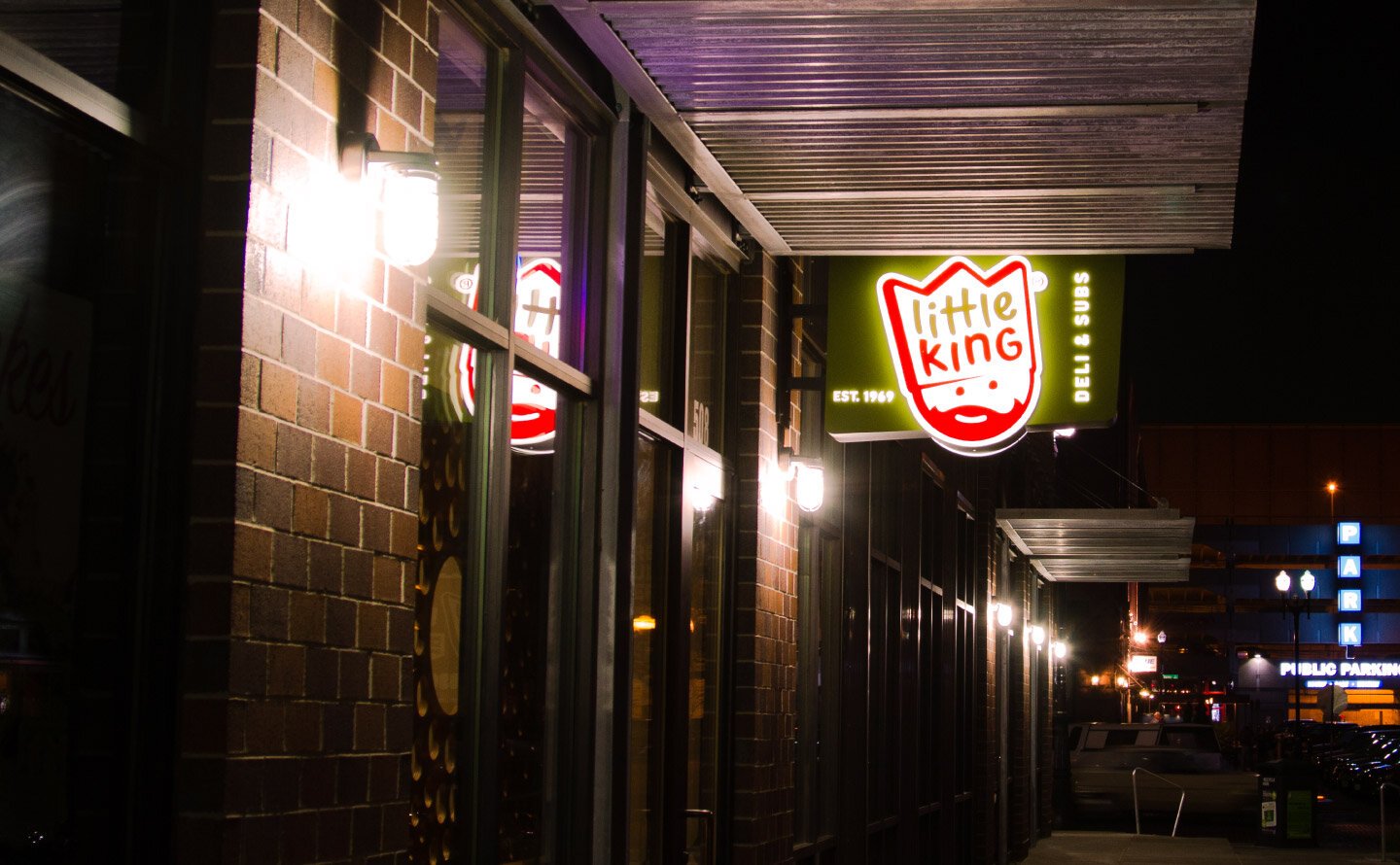
Little King
Revitalizing a Beloved Brand
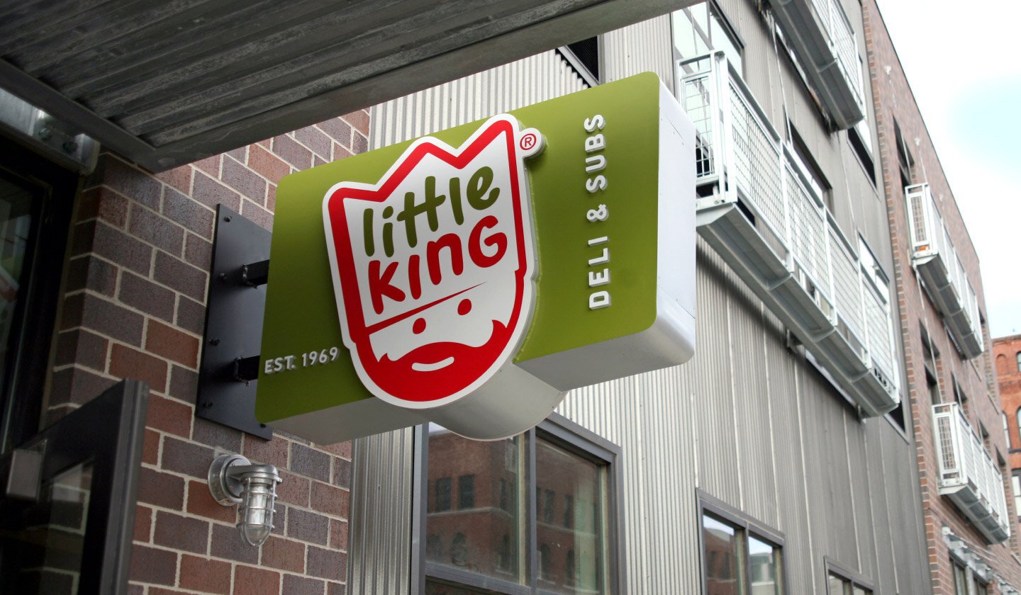
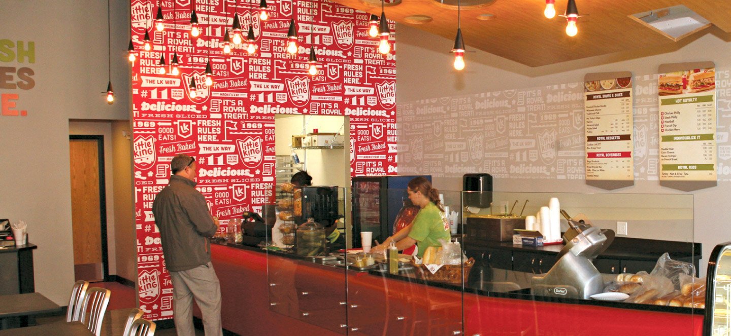
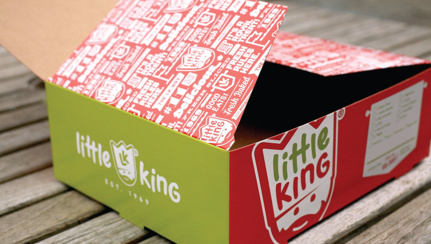
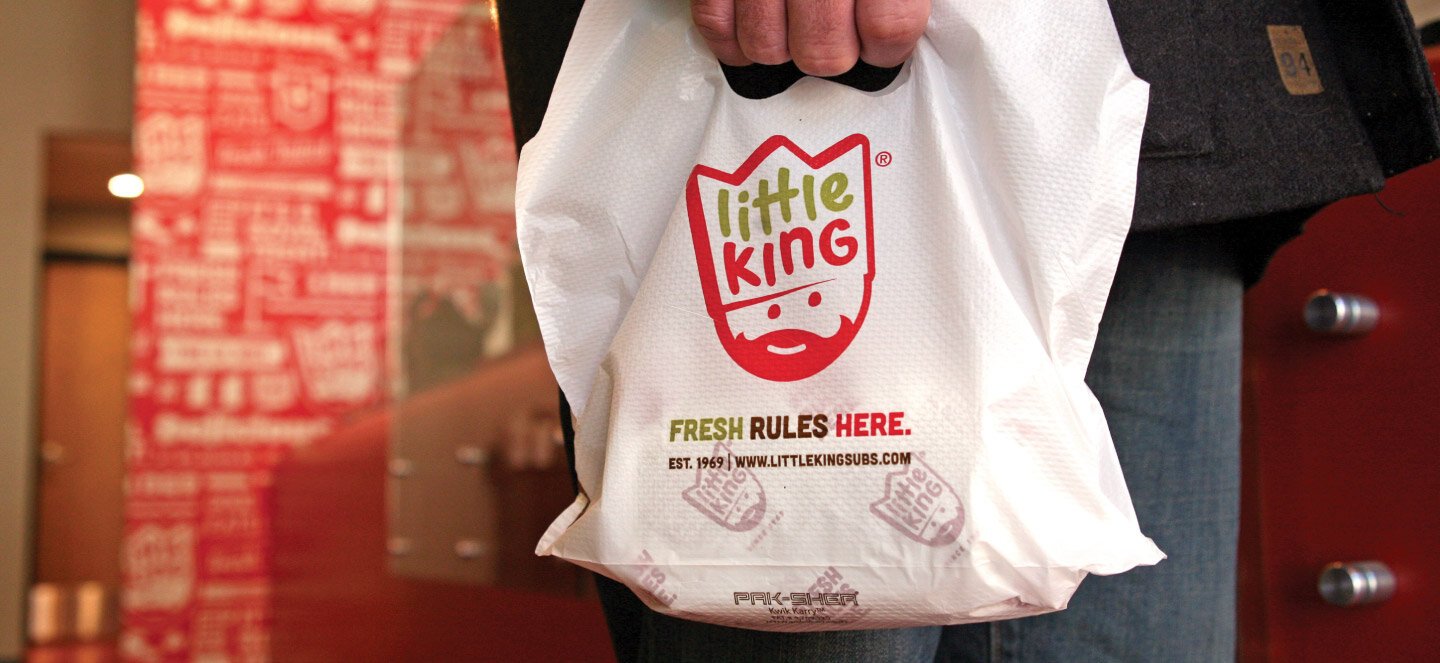
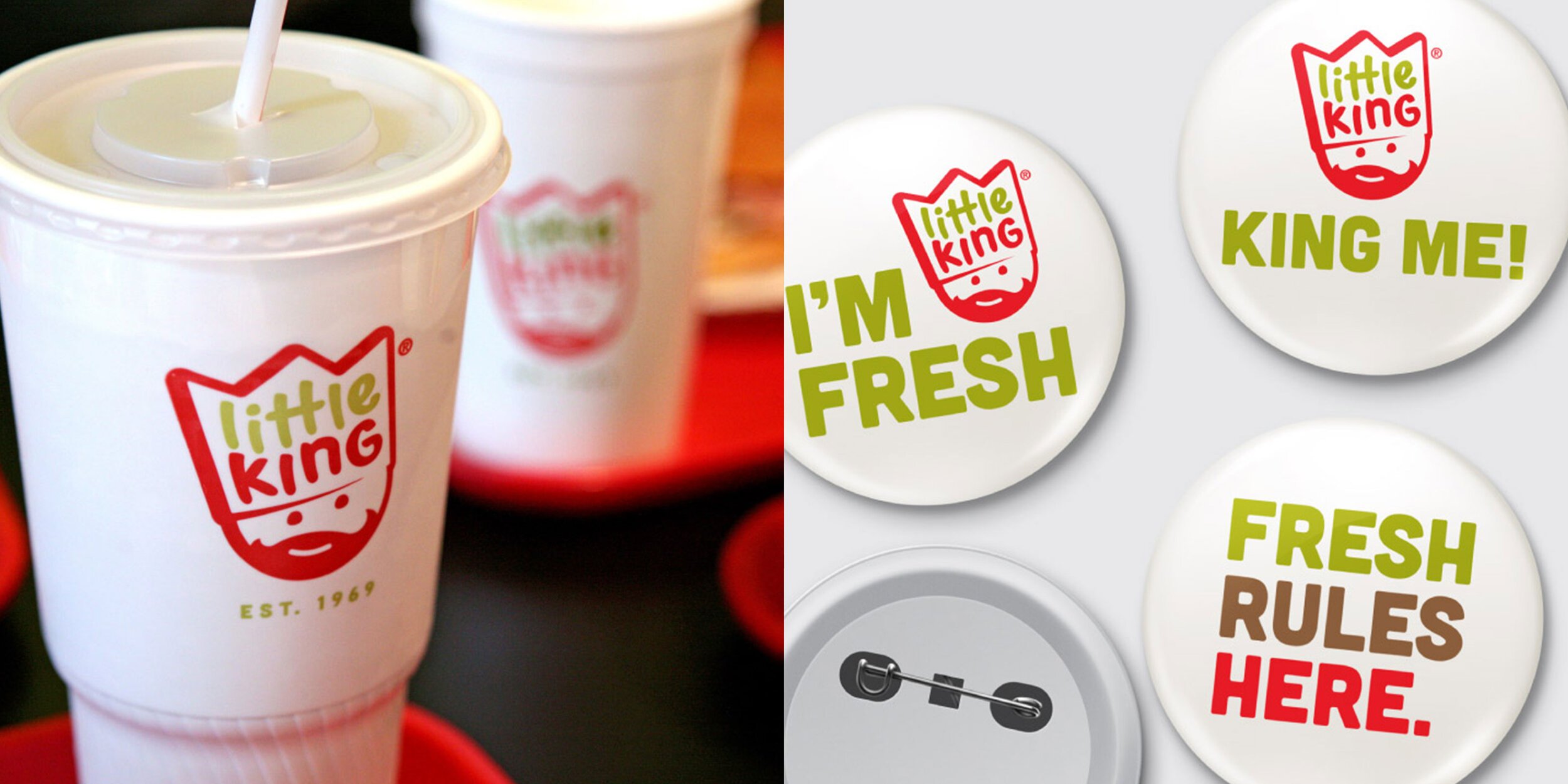
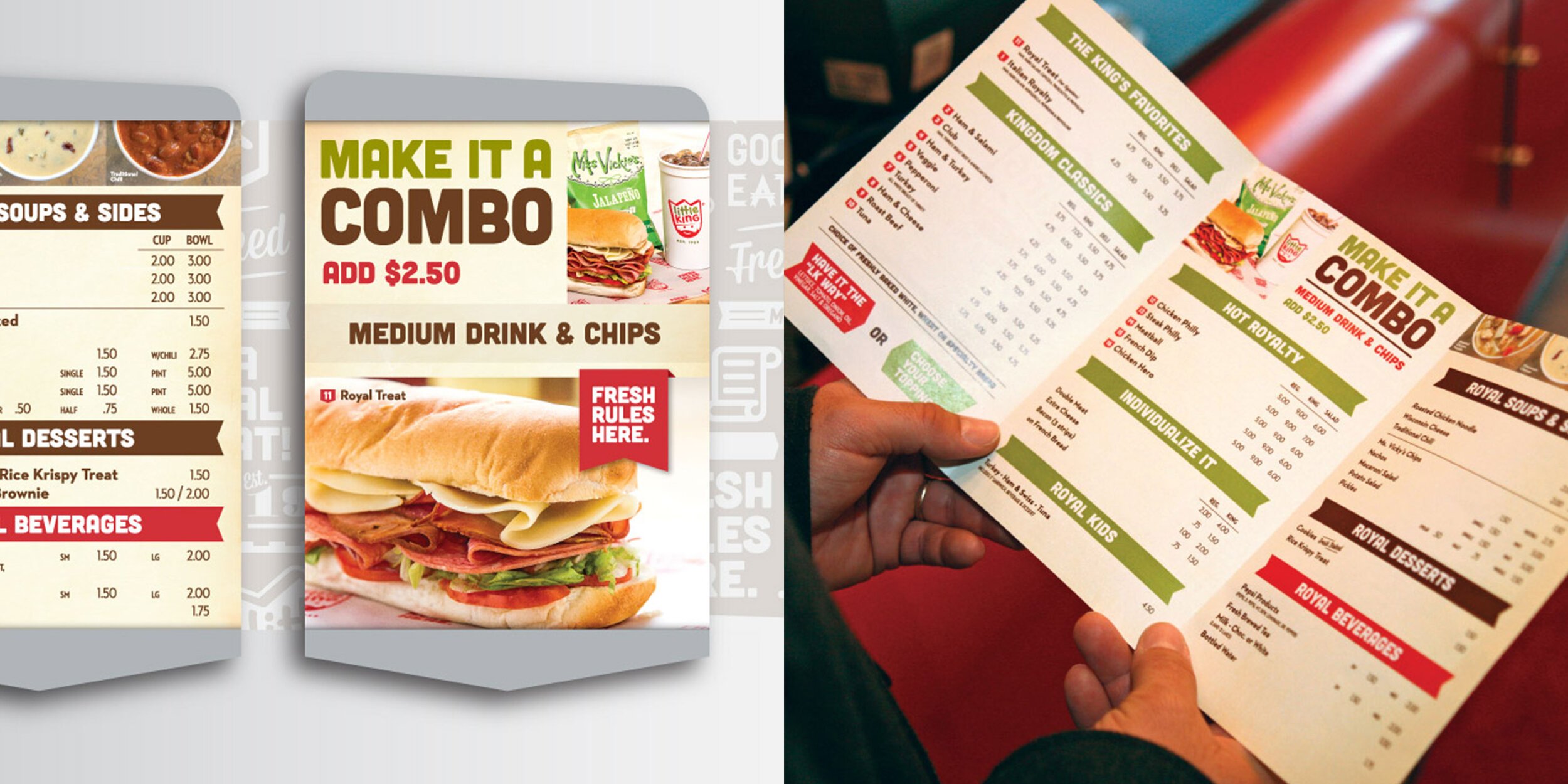
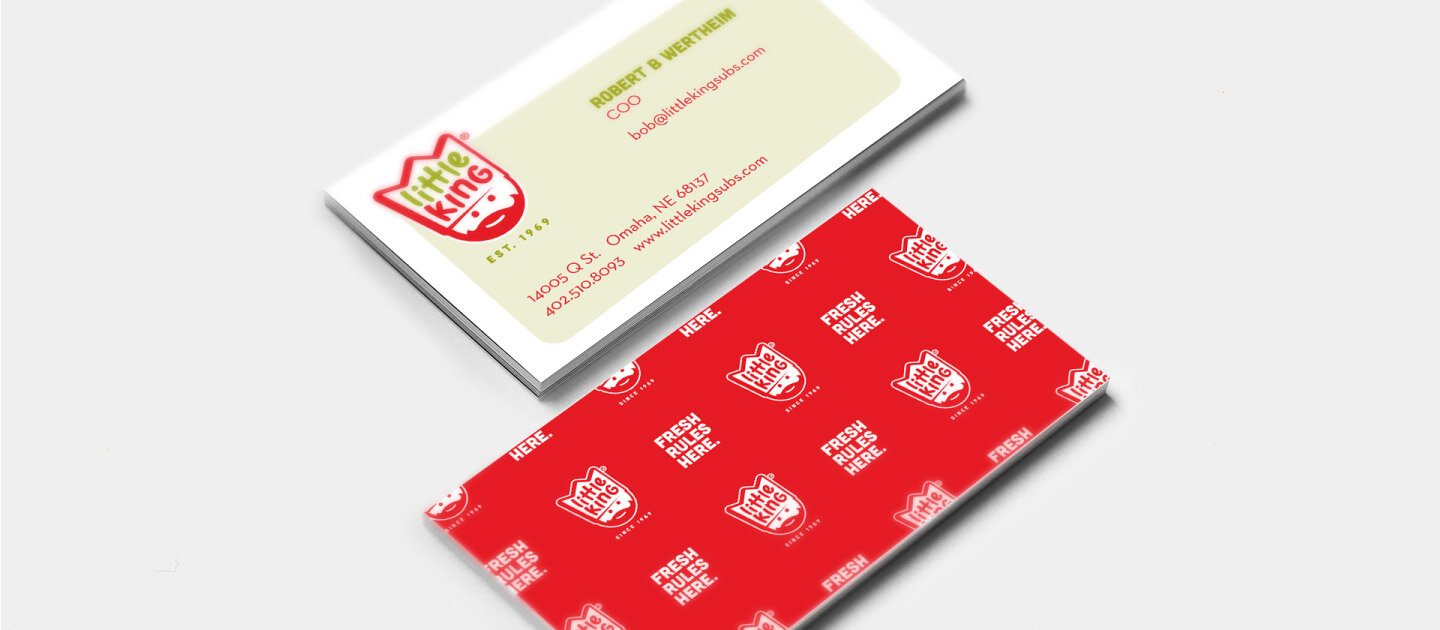
Little King had a passionate following but needed a brand evolution that could modernize its presence while honoring its nostalgic appeal. We reimagined its visual identity, refreshed its brand voice, and created a seamless in-store experience—preserving the elements that made Little King beloved while making it relevant to a new generation of customers.