
Children’s Hospital & Medical Center
Here’s to a decade of brand partnership
The rebranding of Children’s Hospital required a fresh perspective. It asked people to change the way they had seen the hospital for its 60-plus years and to change the brand that had been its visible symbol for many of those decades.
The process was a collaborative journey. It became clear that this project was not about color schemes and font sizes. It was about capitalizing on the unique aspects of the hospital as a full-service pediatric medical center with top-quality physicians and staff, specialty clinics and services, innovative facilities, and ground-breaking research.
Ultimately, it was all about the kids.
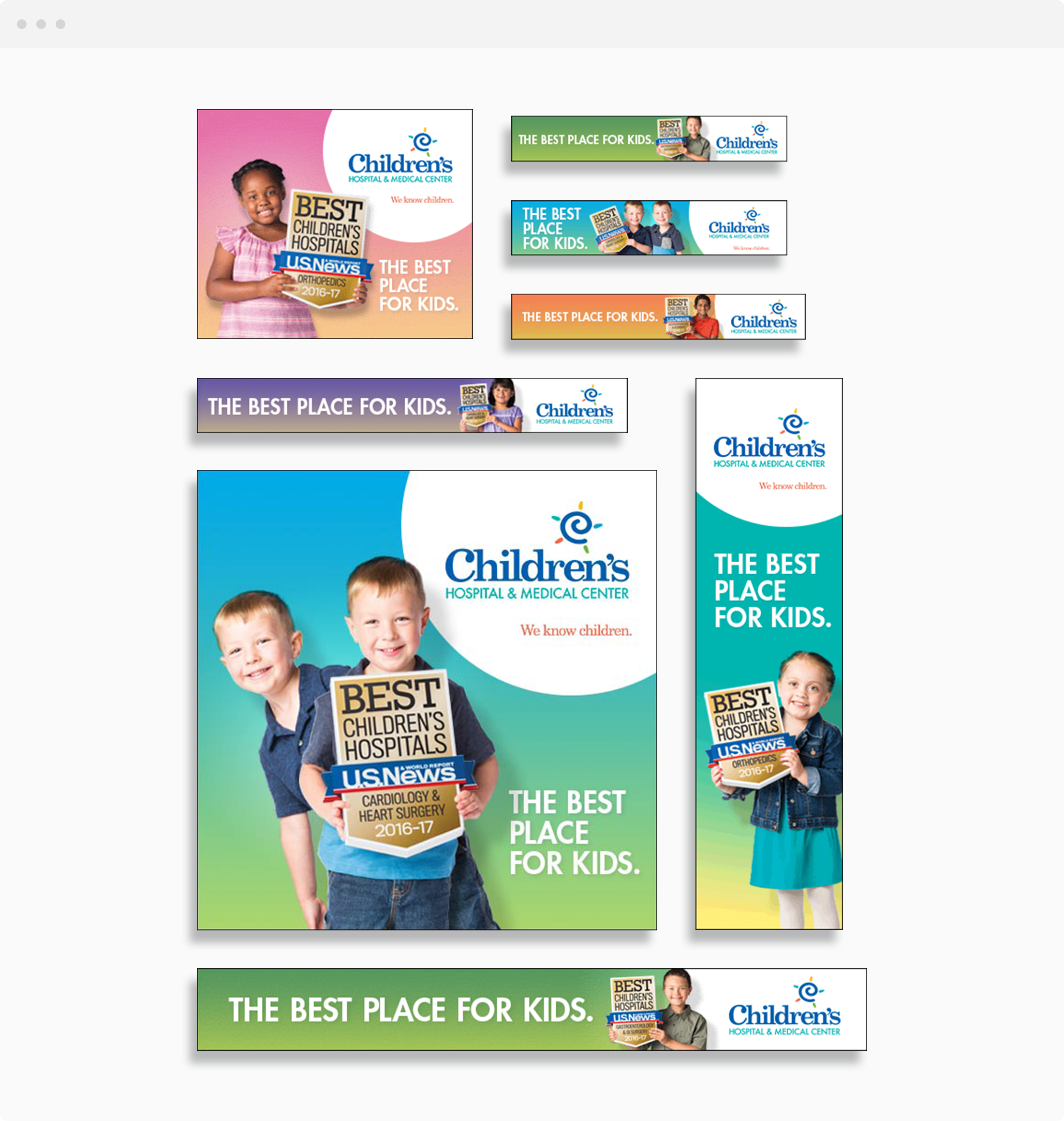
The results were impressive on many levels, with the incorporation of a bold new symbol that captures the energetic spirit of a child – the “spira mirabilis” – and a compelling new slogan, “We know children,” into all forms of communication and media.
Work we’ve done:
• Research
• Brand strategy
• Brand architecture
• Naming
• Brand identity
• Launch tactics
• Website
• Publication design
• Environmental branding
• Signage and wayfinding
• Motion graphics
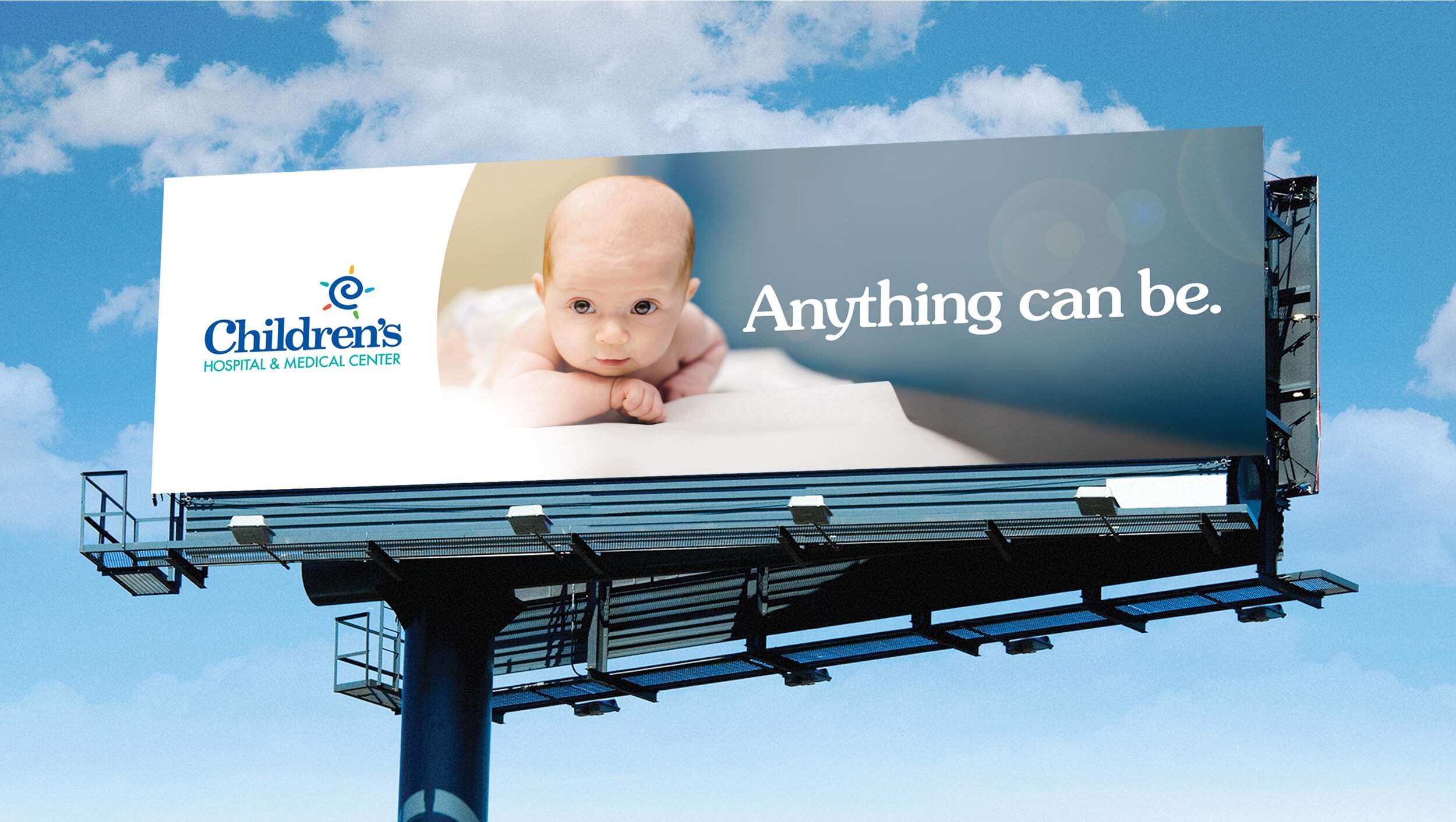
• Advertising
• Business collateralWhen it became orange:
When we debuted the latest ad campaign, we turned to the internal audience watching it and saw many of them dabbing at the tears in their eyes. It was a great reminder that you have to touch the heart to move the mind.


TV
“I want to be the organization that others follow and try to copy. The Daake team really has that same philosophy.”
Marty Beerman
Vice President of Marketing and Communications
Children’s Hospital & Medical Center

11mb PDF