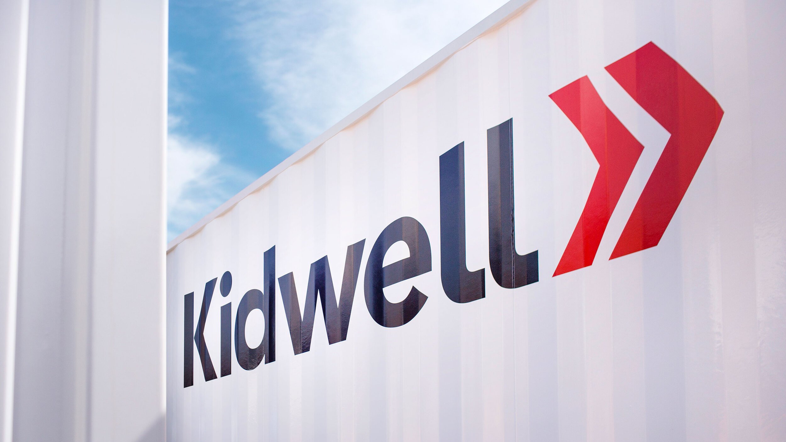
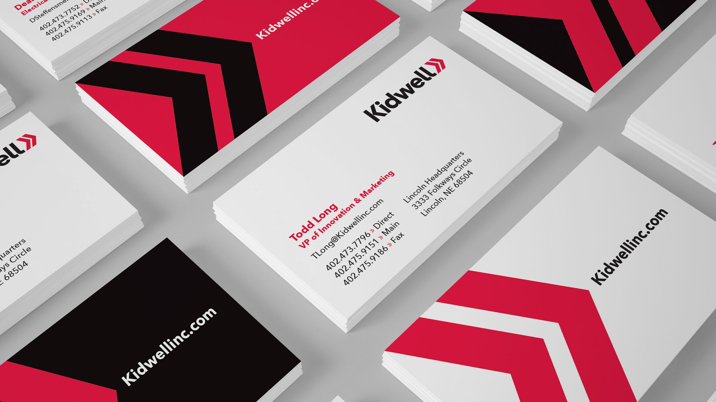
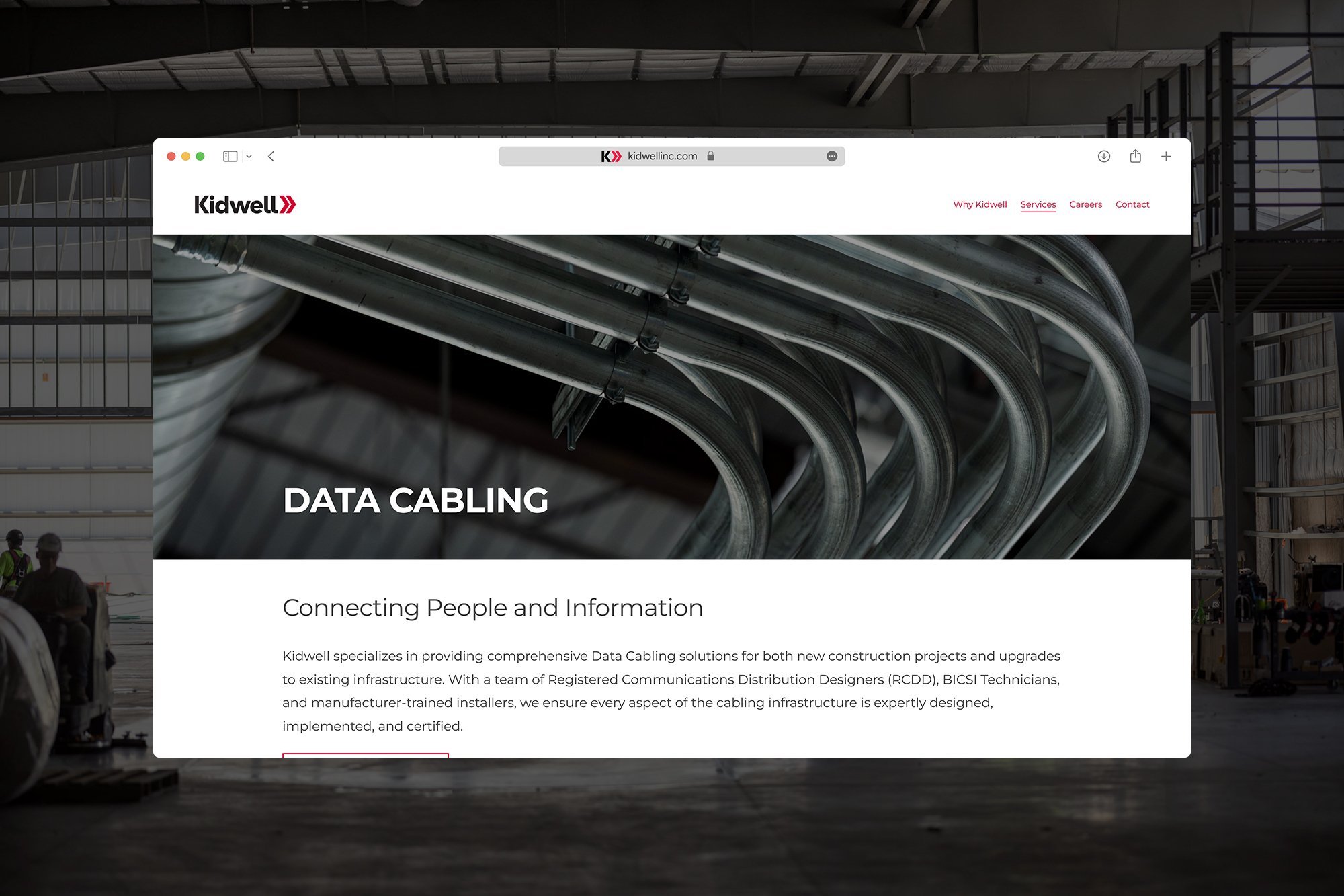
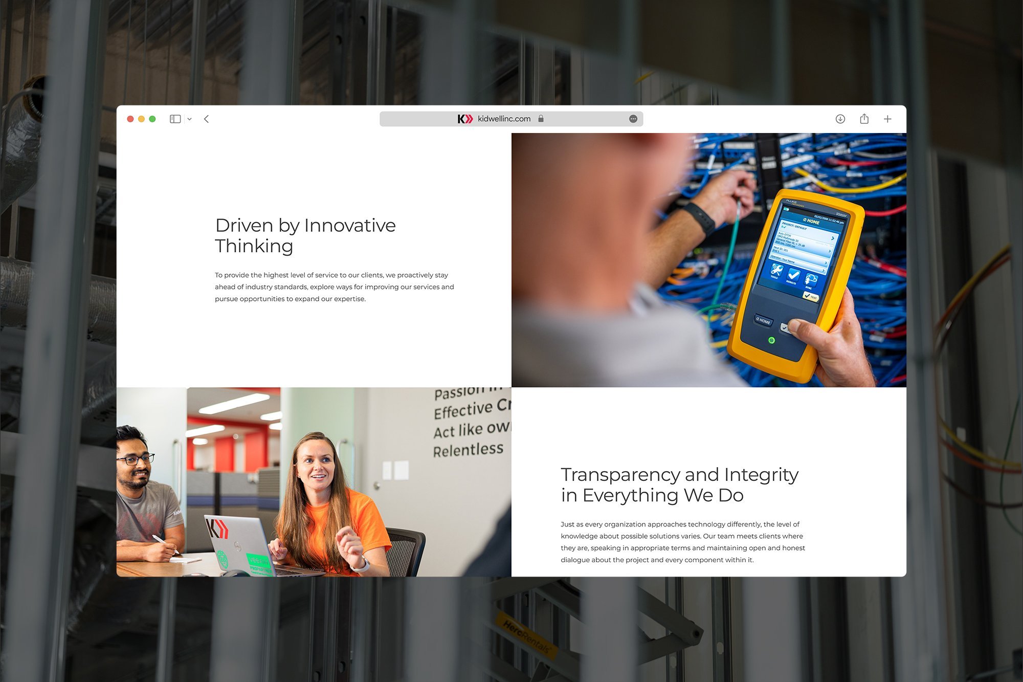
Kidwell
Building the Future of Technology Integration
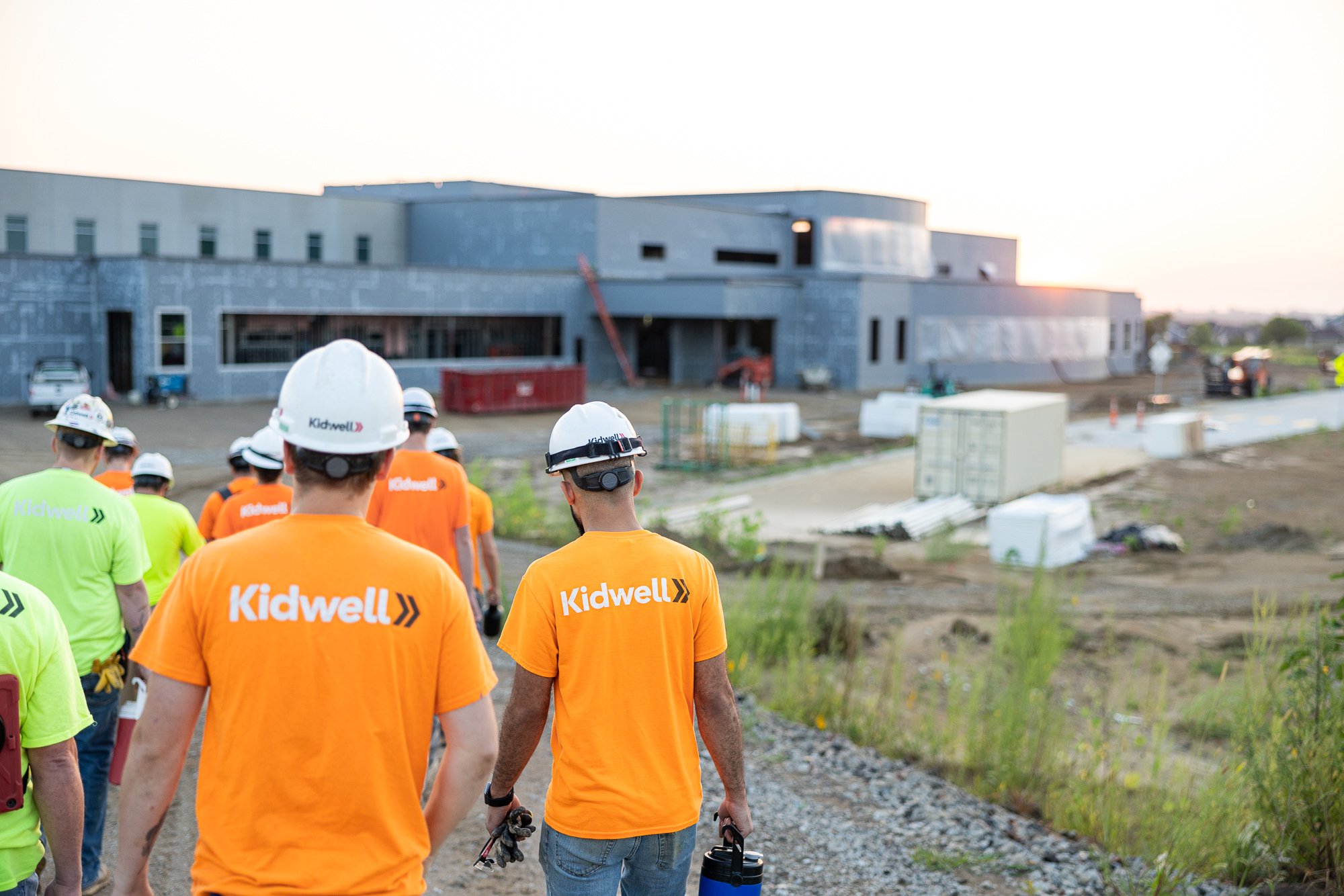
Kidwell needed a brand evolution that could position it as more than a service provider—it was a strategic technology partner. We crafted a modern, human-centered identity that balanced technical expertise with real-world solutions, ensuring Kidwell’s brand communicated confidence, clarity, and future-focused innovation.