Dizzy Mule
Bluestone Development approached our team to help them develop a distinctive brand identity for their latest housing development, Dizzy Mule.
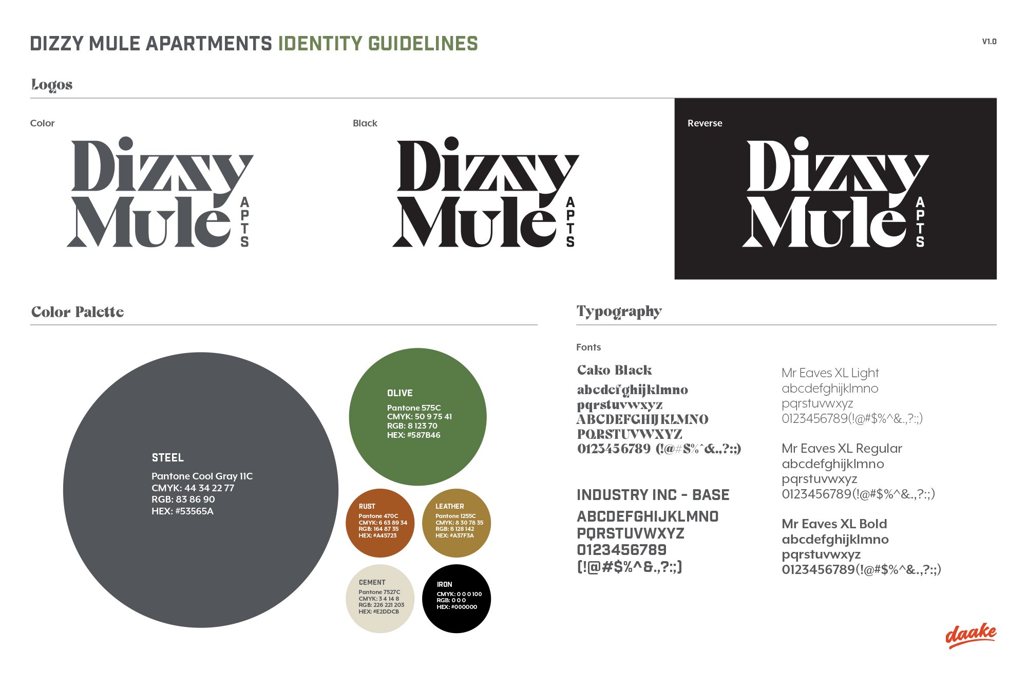
They showed us the vision, vibe, architecture, and personality of a one-of-a-kind apartment complex that could meld the industrial roots and modern creative spirit of its surroundings in Omaha’s Millwork Commons.
They had a lot in place, including an incredibly unique name inspired by the Mules that once lived on the property. But, they didn’t have the perfect logo to tell the story.
Inspired by their vision, we aimed to design something 20th-century traditional yet modern. Something artfully deconstructed that could walk the line between urban and refined.
And after presenting over a dozen contenders, one logo quickly rose to the top for us and Bluestone. With a reversed Z at the center, the logo perfectly balances the influences of the design while slyly hinting at the mention of dizziness in the name.
Creating a logo with the right blend of old and new.
Work we did:
Brand Identity
When it became orange:
When that Z flipped back the other way.